- 4 -
CrowdVerify
December 2016 (~2 weeks)
Shipped
Branding
Front-End Dev
UX/UI Design
INTRO
I redesigned and coded the website for CrowdVerify, a research project on extracting important statements from Terms & Conditions. Check out the live CrowdVerify website.
Original site vs. redesigned site
PROBLEM SPACE
Use design to showcase the researcher's work, engage users, and build credibility
This is a passion project I worked on with a CMU Ph.D. student, Annabel Sun. Her research is about extracting the most important statements from Terms & Conditions so that consumers don't have to peruse 20 pages of policies and can focus on the most important ones. My role was to rebuild the website so that it best presents her work, builds credibility, and engages users through rapid prototyping and testing.
DEFINING GOALS
Together with Annabel, we defined three main goals of the site:
1. Present her research results about policies
2. Encourage volunteers to help her research by comparing terms
3. Build a connection with visitors so that they are more likely to revisit
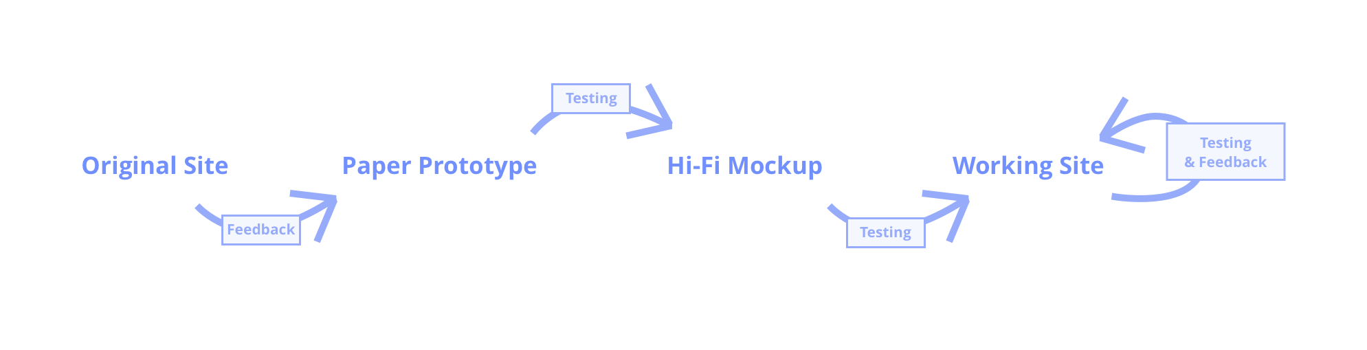
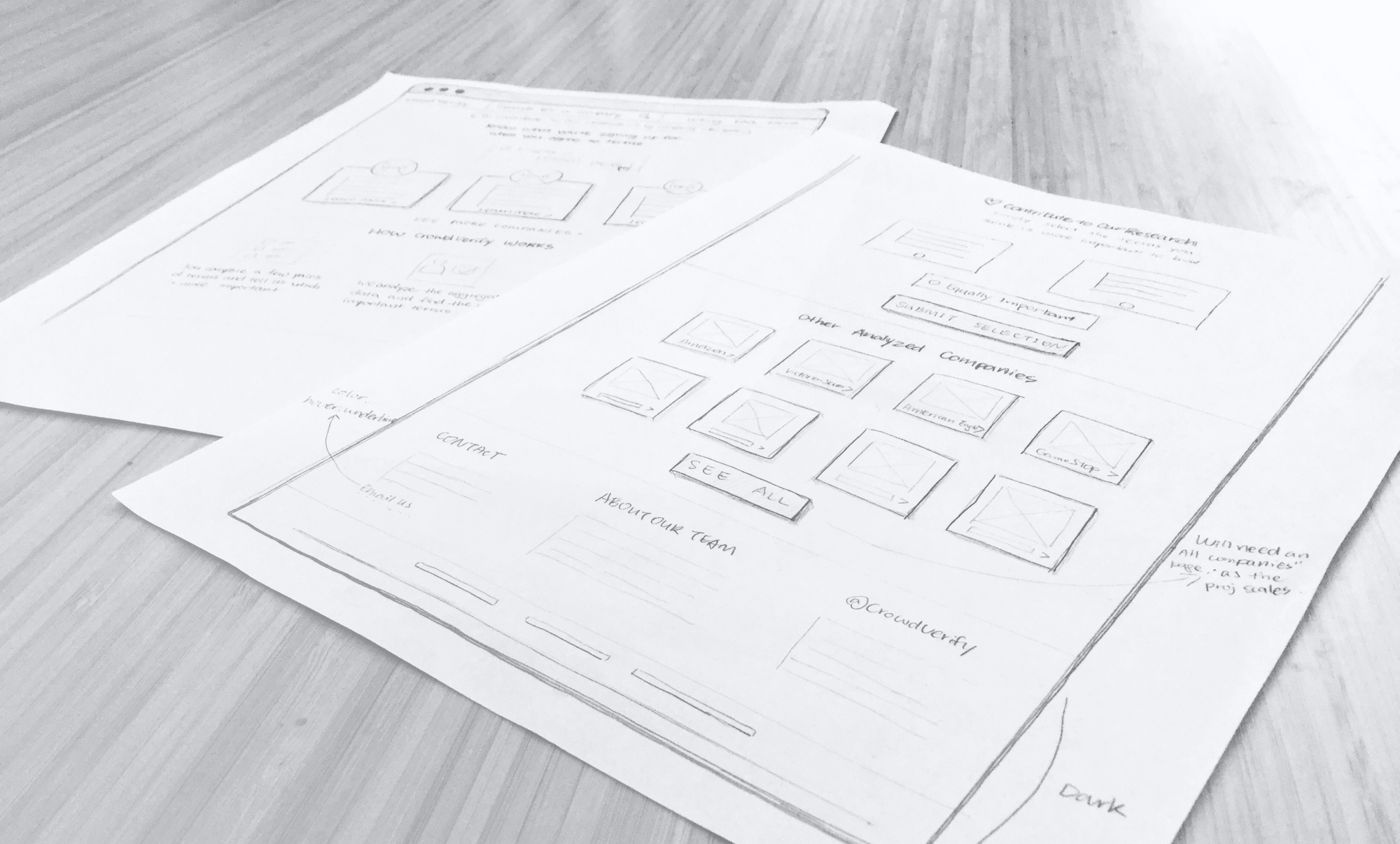
DESIGN PROCESS
An iterative process focused on usability and effective communication
I focused on testing the usability of the site and how well the presented information communicates to visitors. It was an iterative process. With the three defined project goals in mind, we collected feedback from users, extracted insights, updated the design, and repeated.
DESIGN DECISIONS
Direct user attention to what's important
As Herbert Simon famously said, "what information consumes is rather obvious: it consumes the attention of its recipients." Below are some major design decisions I made to direct users' attention:
Increase the legibility of "Sample Terms"
In our studies, we found that users weren't willing to read through the long paragraphs of the "sample statements". I decided to reduce the number of sample terms to present, place information in cards to increase legibility (shorter text width), and highlighted key sentences to help users scan.
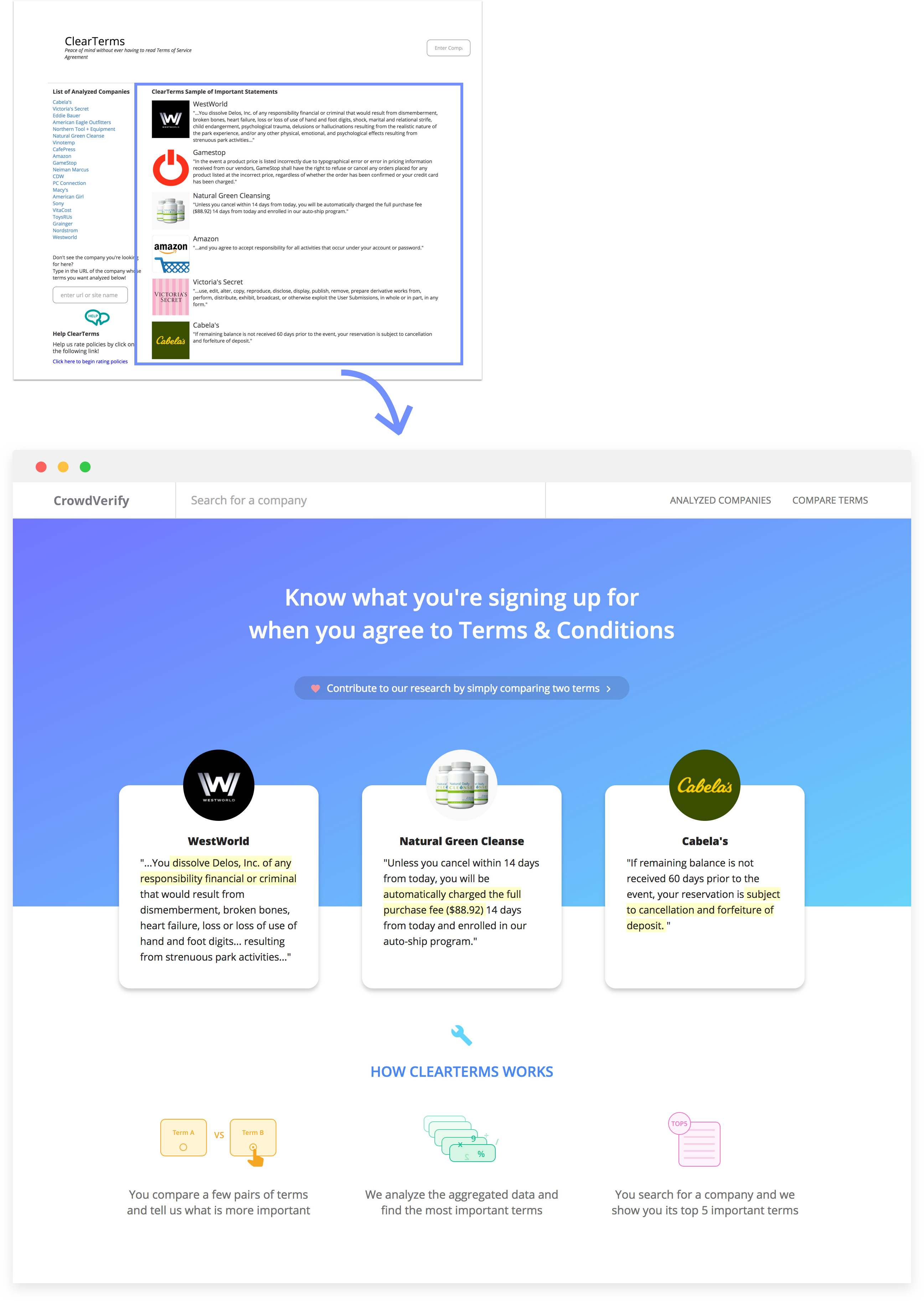
Sample terms are shown in cards and key sentences are highlighted
Make "Contribute to Our Research" a call-to-action
This is an important call to action, but while testing the old design, some users didn't even notice it. It was neither taking enough real estate, nor drawing much attention. I added the call-to-action on the hero section and created a new section, not the homepage to allow visitors to compare terms without going to another page. This helps reduce churning.
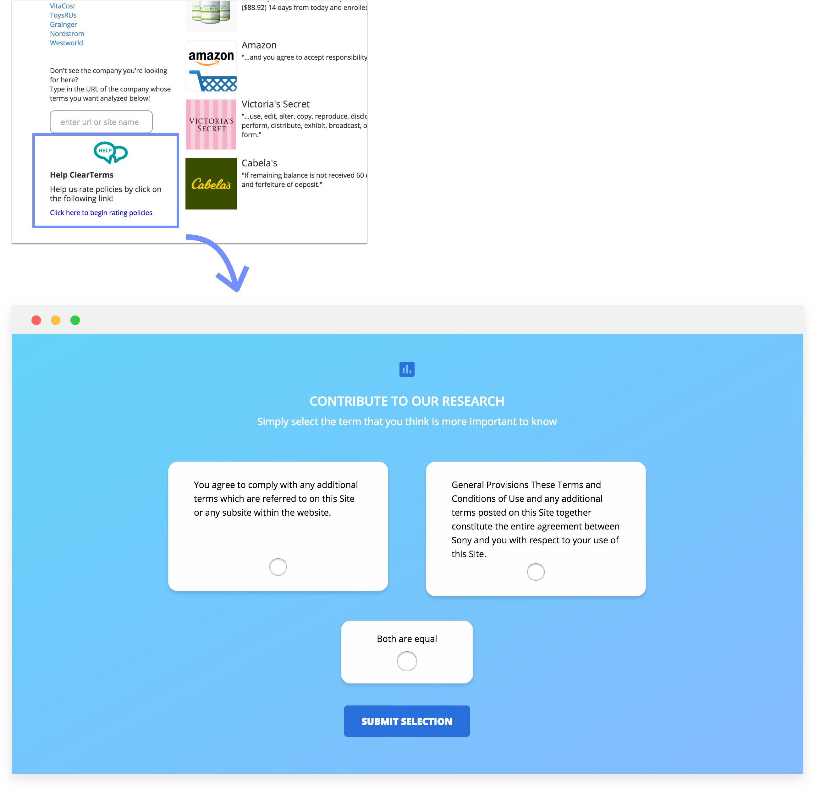
Gave "Contribute to Our Research" a lot more real estate
Simplify the list of analyzed companies
In our studies, we found that users actually won't read through the entire list. And there is no reason they need to. Simply showing some recognizable company icons will evoke interest to see more.
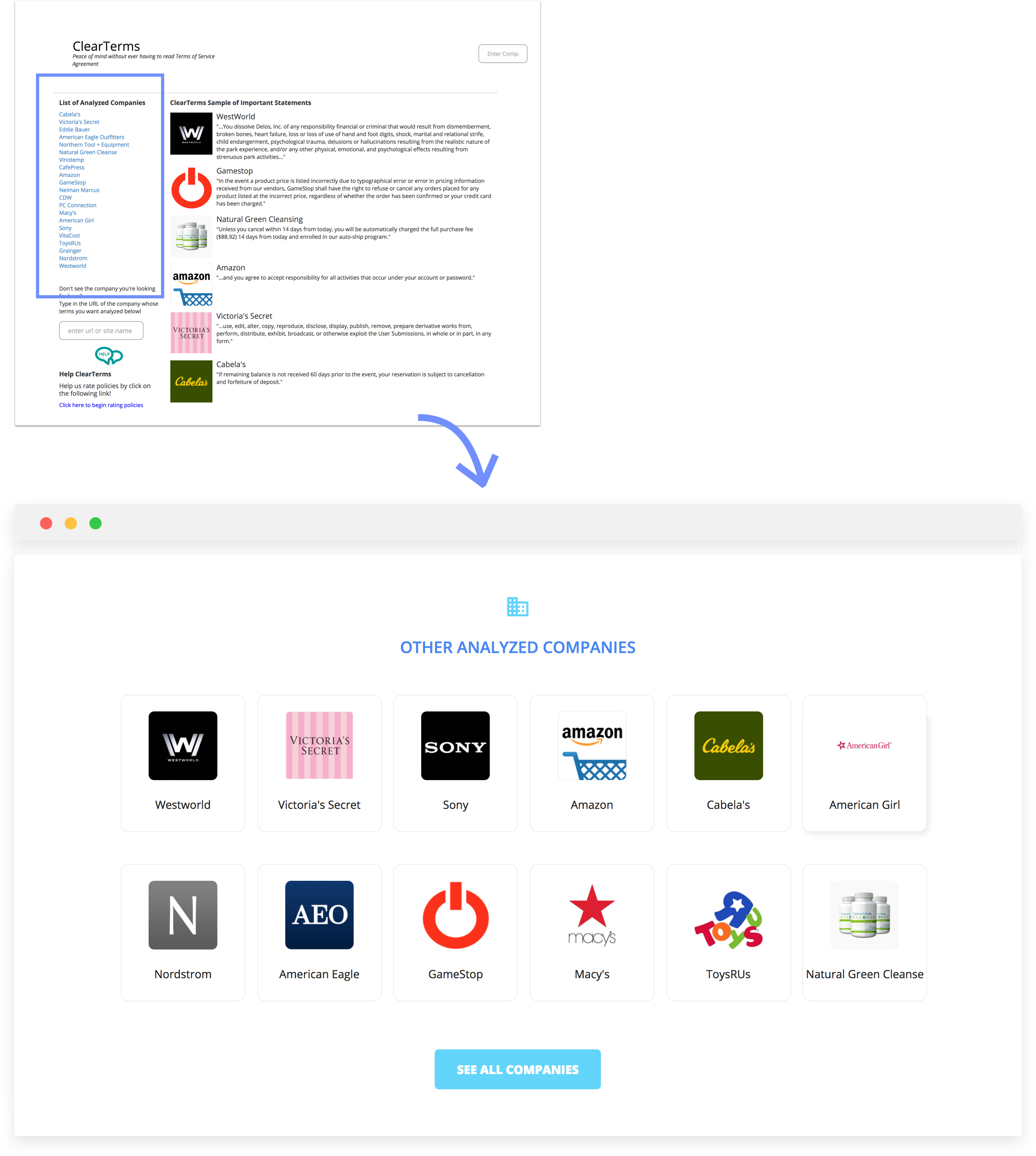
Visualized list of companies with logos
BRAND IDENTITY
An approachable visual system that builds trust
For a site that informs people about legal policies, establishing trustworthiness is crucial. At the same time, the visual style also needs to appear friendly and engaging.
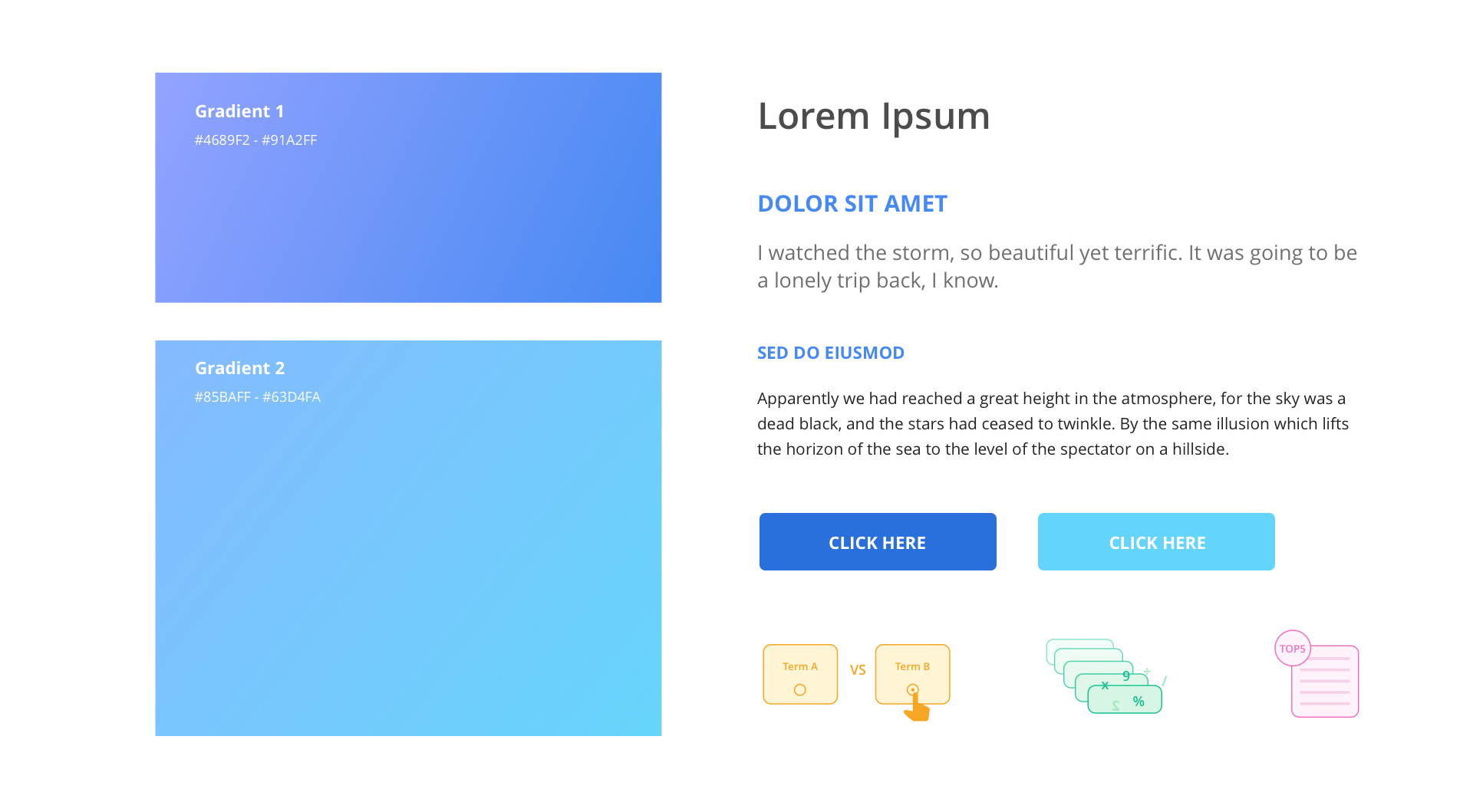
Regarding color choices, I chose purple-blue-turquoise gradients. The blue create a professional identity, yet the unconventional hues added a modern/techy touch. The typeface, Open Sans, creates a credible and approachable aura.
REFLECTIONS
I acted as a design consultant and worked directly with the owner of the research project. Since I only had about 10 days to design and deliver code, project management and effective communication were crucial.
Because of time constraint, we had to make compromises: sometimes it means changing the design to make it easier to code and sometimes it means postponing certain functions due to technical difficulties. The website is not perfect. For example, the search bar doesn't yet show the text "no results found" when the situation occurs. The interaction of the individual company pages is not optimal. With limited time and resource, prioritization is necessary to ensure the timely delivery of the product.